Website & User Engagement
Kindred / 32Red — Lead Product Designer — 6 months — 2023-2024

⚠ Some visuals are restricted or anonymised due to ongoing NDA obligations.
📣 Context
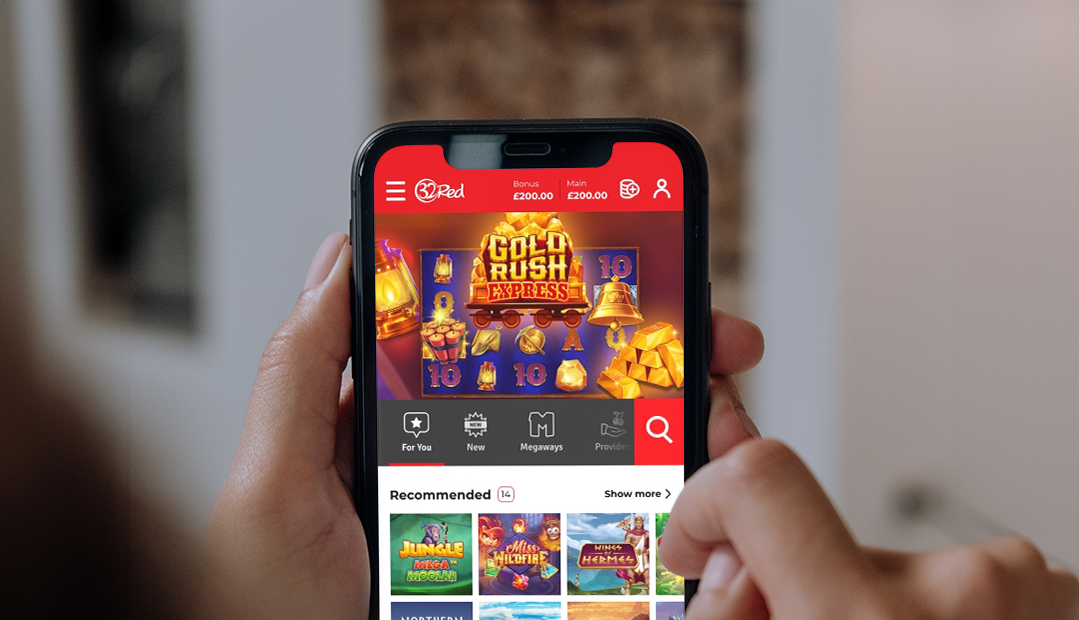
The 32Red front-end was solid and mature, and it handled the day-to-day complexity of iGaming well. But it ran on older technology that blocked new features, UX improvements and performance gains. Replacing a platform that still works is the hardest kind of change to make: the business has to believe it is worth the risk.
A casino front-end also carries problems specific to the sector: more than 5,000 games across providers, a constant flow of CRM campaigns and daily promotions, and strict regulation. The brief was a new platform, framework and visual language that keep players safe without making them feel watched.
🏆 Scope & Outcomes
- In every round of testing, with players and with colleagues across the business, satisfaction with the new design was consistently high, and so was the business-value score.
- The work was handed over on time with a research plan and an ongoing test plan, so new features kept shipping after launch.
🥋 My Role & the Team
I led the design side of the rebuild with a team of researchers, product designers and content designers plus information architects. All of our findings informed the design decisions, and were shared between all involved teams for visibility and early feedback.
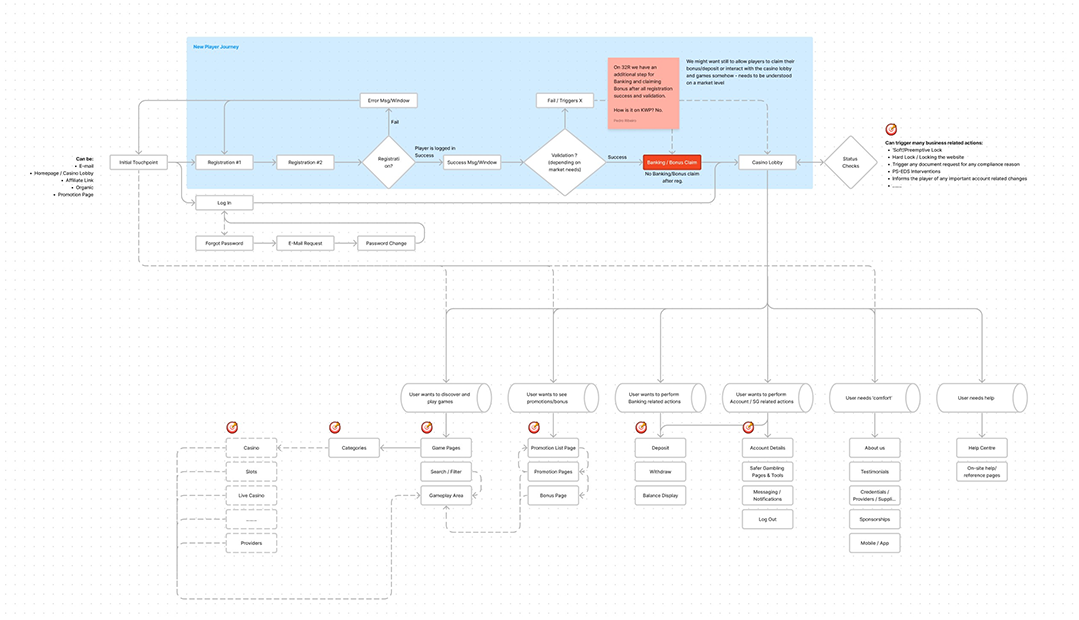
I set the research goals and methods before design started, agreed scope and timelines with stakeholders and the wider organisation, defined the overall architecture and the key user journeys, and led the creation of the design system the whole experience is built on.
🧭 Key Decisions
- Start from a blank canvas. While scope was still being agreed, we asked what the best casino experience would look like, using everything previous projects had taught us. Design exploration ran in parallel with the definition meetings instead of waiting for them.
- Research before design. The research goals and methods were set first, so early decisions were informed rather than defended later.
- System first. The design system and visual language started on day one, so the team was producing prototypes early and reviewing them with other teams at every step.
- Release progressively, market by market. The new site was planned to roll out across markets in stages rather than in one switch.
- Safe without feeling watched. Compliance, player safety and affordability learnings were built into the ecosystem itself, with the player at the centre of every change.
👥 How I Led It
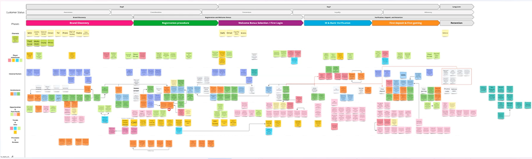
Interviews with internal teams, stakeholders and players shaped the roadmap, from research to design and architecture. Regular reviews with stakeholders and the delivery teams kept the pieces aligned, while testing confirmed we were on the right track.
We worked in the open, and it paid off: other teams came to us during the project rather than after it, which kept everyone aligned and avoided late surprises.
🖼️ What Shipped
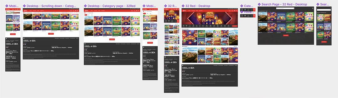
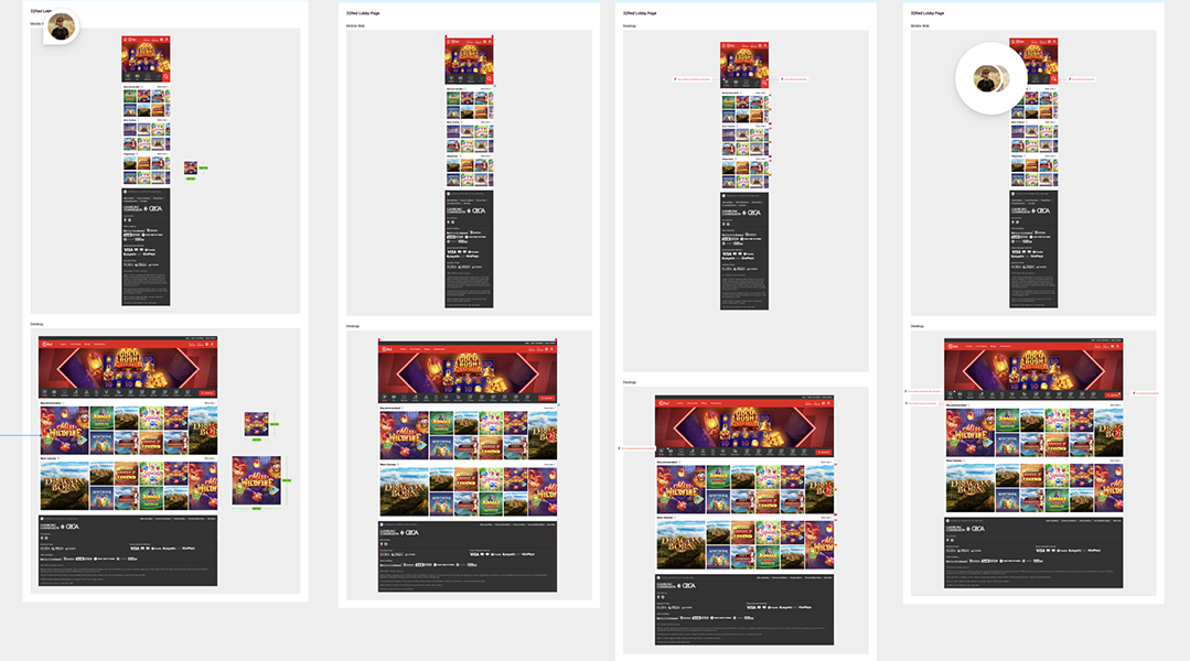
- A new design system and visual language, built on the new brand identity guidelines.
- Multi-platform, multi-language, multi-locale and multi-currency templates, with deep SEO built in from the ground up.
- Personalisation at the core: player profiles, favourites with smart recommendations, a customisable dashboard and promotions tailored by segment.
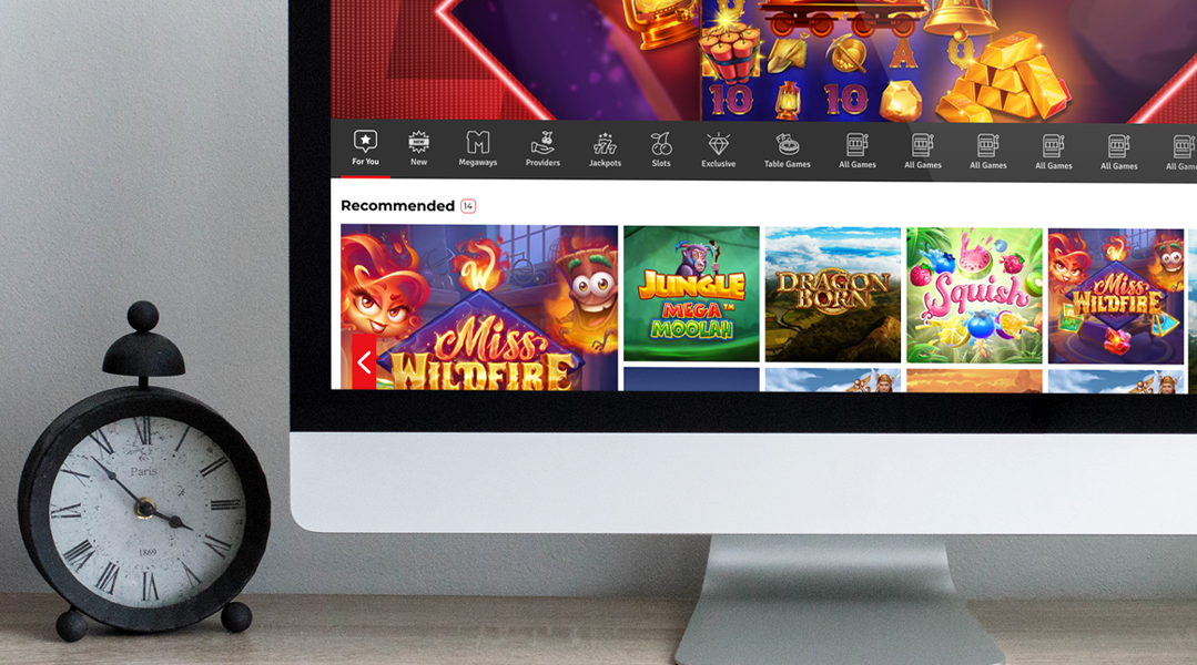
- Game discovery for 5,000+ games, with advanced filtering by category, provider and feature, plus real-time events, tournaments and leaderboards.
- Safer gambling built in (deposit, loss and wager limits and self-exclusion), with segmentation and server-side A/B testing for ongoing optimisation.
🧠 Takeaways
- Replacing what still works needs a reason everyone can see. The blank-canvas exercise, combined with a summary of previous learnings, gave clear priorities and a roadmap from the start.
- Work in the open. When other teams can see the work early, alignment stops being a meeting and becomes the default.